Color on a beach budget lives in one of two places: cheap bulk pieces like napkins, glassware and sashes, or labor-heavy installs like arches and overhead florals, and the palettes below sit at both ends.
Light settles the rest, because pale blush washes out under open midday sun while deeper shades hold their color, so Balancing Light and Dark is worth reading before you buy anything.
The last 3 sections cover how to test and balance whichever palette you choose.
1. Oceanic Blues and Sandy Neutrals
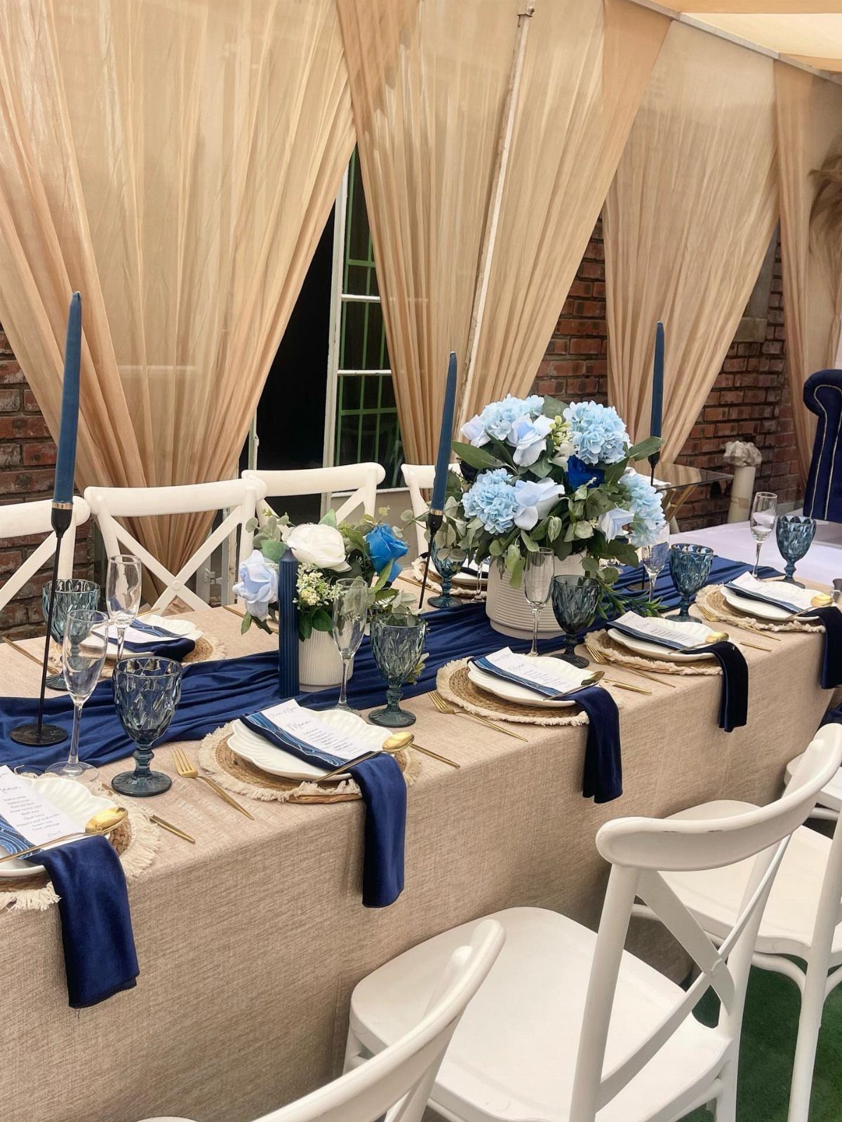
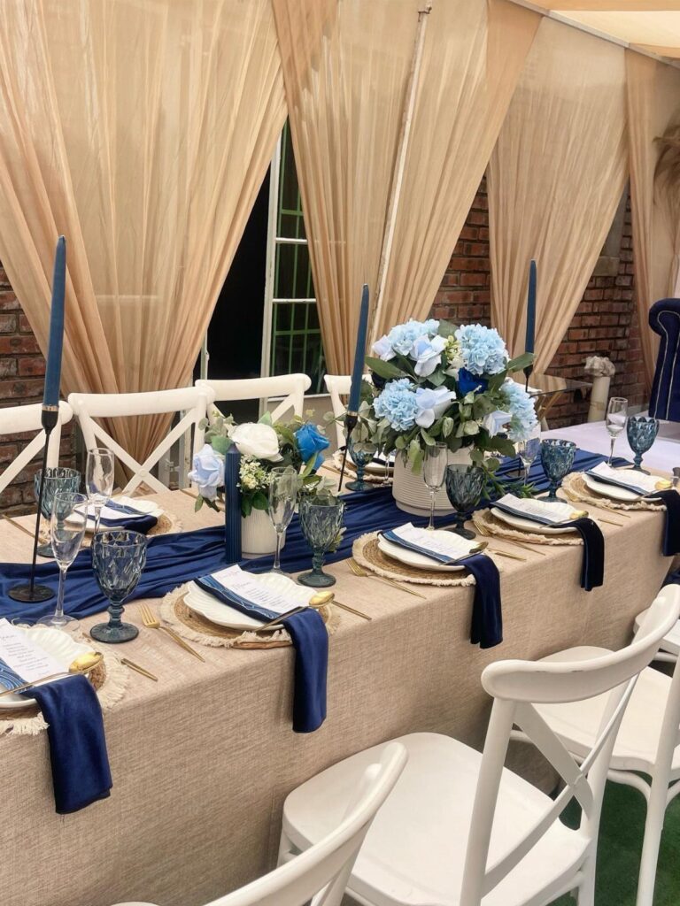
Navy does the heavy lifting here, and beige keeps it from feeling heavy. Navy runners and napkins sit on a beige tablecloth, so the dark color shows up in small, repeatable pieces rather than covering the whole table.
I like that approach for a budget. Linens in 2 colors, plus blue candles and glassware, are easy to rent or buy in bulk and carry the palette without extra florals.
If you want more depth, add a lighter blue flower to the centerpiece so the navy has a softer step between it and the cream.
2. Dusty Blue Beach Wedding
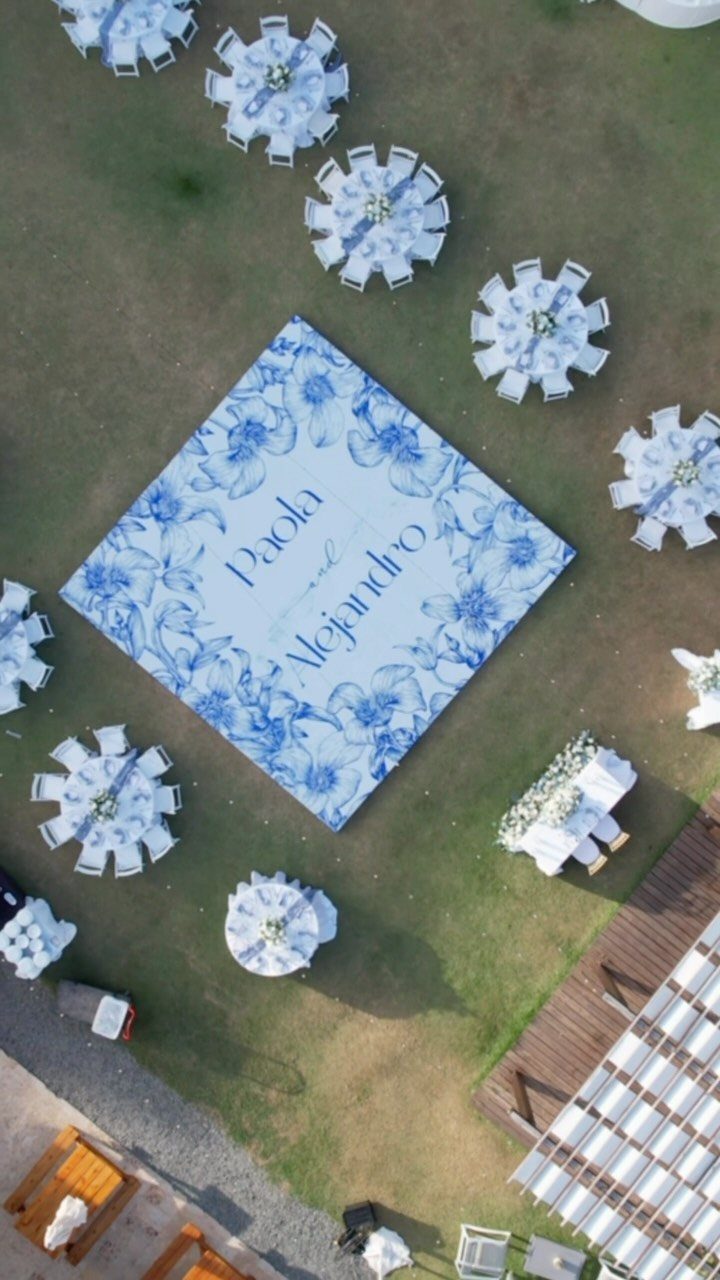
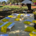
A dance floor printed in dusty blue florals makes the color part of the ground itself, not just the tables. On a grassy reception site with white tables, that one big surface carries the whole palette.
White tables are the right partner. They keep the blue from competing with anything else, so you can spend on the floor and keep the rest plain.
A custom floor with your names on it costs real money, so price it early. If it stretches the budget, I would put the blue into napkins and signage instead.
3. Blush Pink and Champagne
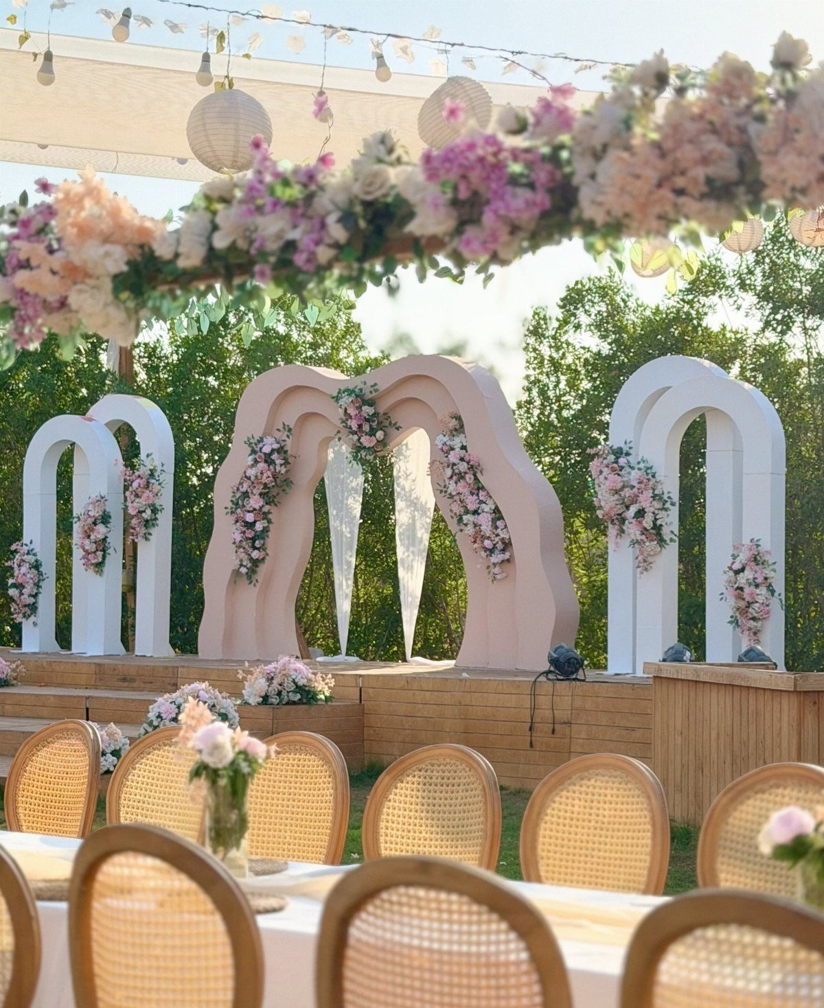
Blush against champagne reads soft but stays grown-up, because the champagne tone keeps the pink from turning sweet.
Keep the flowers in the pink and white family and let the chairs and arches supply the warmer neutral. A white canopy with lanterns overhead holds it together without adding another color.
Pick one pink and stick to it. 2 different blushes side by side can look like a mistake.
4. Rusty Terra Cotta
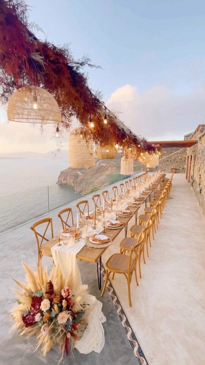
Terra cotta is the palette I would choose if you want a beach wedding that avoids the usual blue. Against an ocean view, the rusty orange stands out instead of blending in.
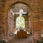
Gold chairs, a long wooden table and dried foliage overhead keep the whole look earthy, so the florals do not have to do all the work. Dried materials also give you texture at a lower stress level than fresh arrangements.
Use the color in clusters, not everywhere. A few strong terra cotta arrangements down a long table beat a dozen weak ones.
5. Gray-Blue and Dandelion Yellow
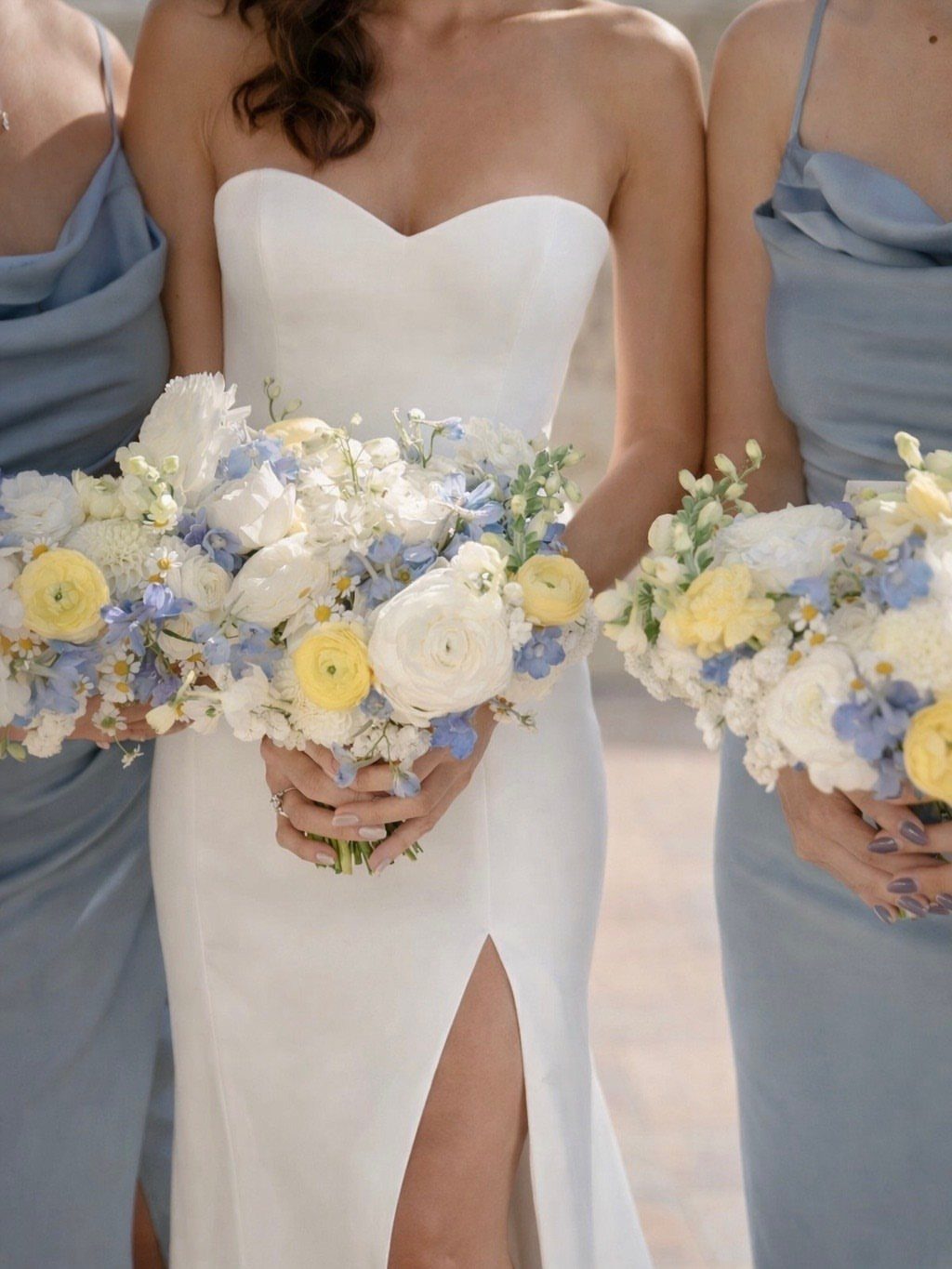
Yellow and gray-blue work because they are both light enough for strong sun. Bridesmaids in pale blue dresses holding white, blue and yellow bouquets show the balance: the blue is the base, and the yellow is a small bright accent.
For bouquets, keep white as the filler so the dandelion yellow stands out instead of crowding the blue. A few yellow stems go a long way.
This is a daytime palette. I would not choose it for an evening reception, where the yellow loses its glow.
6. Burgundy and Dusty Blue
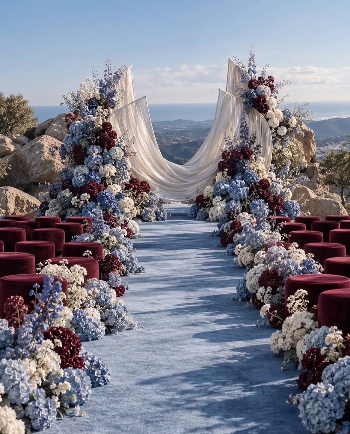
Burgundy velvet seats along a blue aisle give a ceremony drama with no extra props at all. The 2 colors do opposite jobs: burgundy brings weight, dusty blue softens it.
Large arrangements in burgundy, blue and white tie the seating to the aisle. White matters here, since it gives the eye a place to rest between 2 moody tones.
Ocean and cliff views are already a strong backdrop, so keep the setup simple and let the color blocks do the work. I would spend on the seating and aisle before anything else.
7. Coral Pink and Turquoise Tropical-Inspired Décor
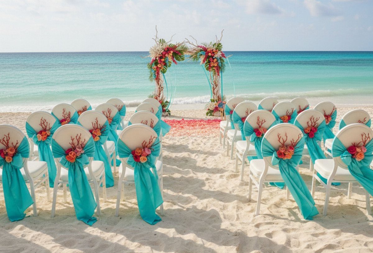
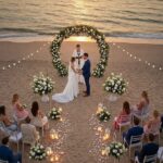
Turquoise sashes on white chairs echo the water, while coral flowers on the arch and along the chairs pull warmth up from the sand. Each color has its own job, so neither fights the other.
Fabric sashes are a cheap way to carry the turquoise, since white chairs do the rest. Let coral live in the bouquets and boutonnieres, and trust the water and sky to handle the turquoise.
I would hold the palette to those 2 colors plus white. A third bright shade would tip it from tropical into busy.
8. Mismatched Pastel Palette
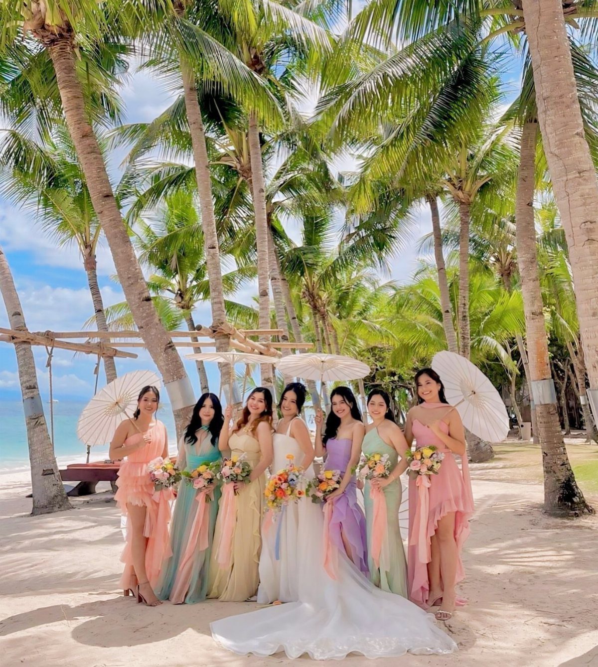
Six bridesmaids in six different pastels, with the bride in white, make a group that reads as a bouquet before anyone holds a flower.
Peach, mint, lavender, yellow and light blue all sit at the same softness, which is what lets them mix.
Keep every dress at that same level of paleness. One saturated shade breaks the set.
White parasols and bouquets give the eye a calm common thread, and you can buy them cheaply. Let each bridesmaid choose her own dress within the color family, and you save everyone a fitting fight.
9. Olive Green and White
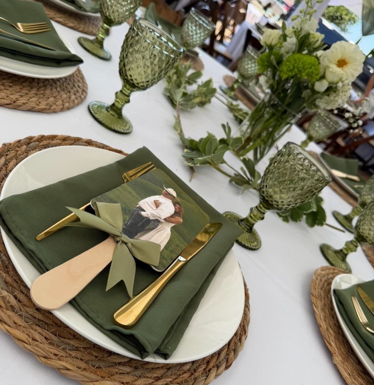
Olive green napkins and green glassware on crisp white plates can carry a table’s whole color story, no flowers required. The woven chargers and gold cutlery add texture and warmth, so the green never looks flat.
This is the cheapest way I know to commit to a palette. Napkins and glassware are bulk items, and white plates keep the rest neutral.
Choose one olive tone and match the glassware to it. Tucking a small photo of the couple into each napkin adds a personal touch for almost nothing.
10. All-White Coastal Elegance
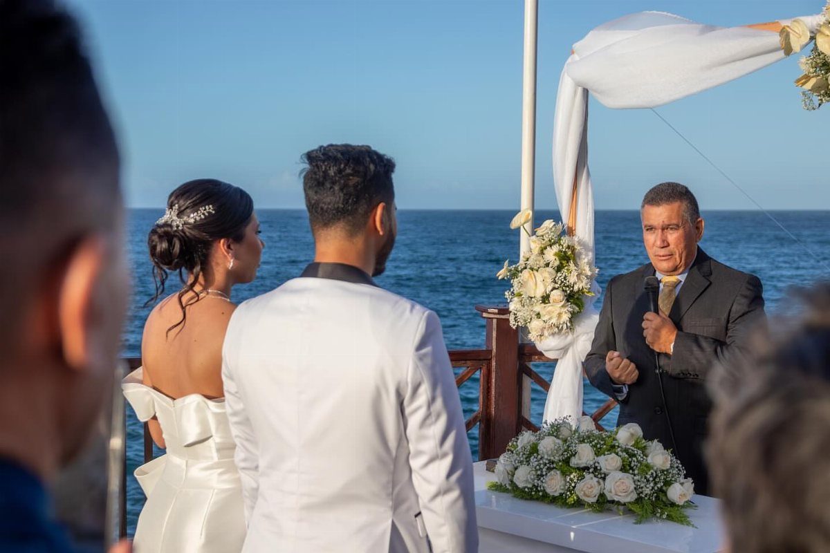
Dressing everyone in white and filling the altar with white flowers lets the ocean be the only color. That restraint is the whole look, so I would not add a colored accent to the florals.
Variety comes from texture, not hue: mix flower shapes, and let fabrics differ in weight. Without that, all-white can read as flat.
Be warned that white shows every shade difference. Hold fabric swatches side by side before ordering, so the ivory and the bright white are not mixed by accident.
11. Vibrant Tropical Citrus Florals
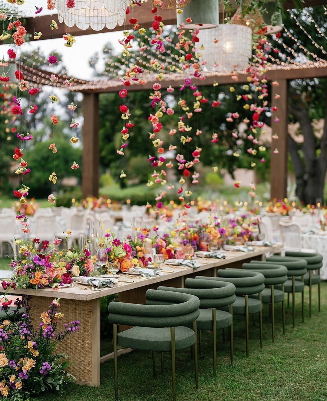
Hanging garlands of fuchsia, orange and yellow blooms turn a wooden pergola into the main event. Over a long wooden table with green chairs, the bright flowers feel natural, since the wood and green already read as garden.
Put the color overhead and keep the table simple. That way, the florals do the work once, instead of twice.
Hanging pieces take more flowers and more labor to install than table centerpieces, so ask your florist for a price on both before committing.
12. Bold Purple and Yellow
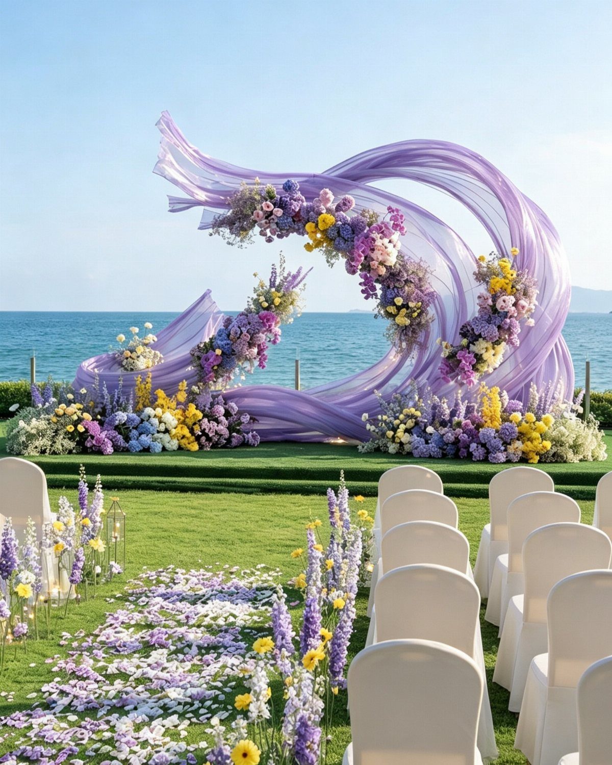
Rich purple fabric draped into a flowing arch, dotted with purple, yellow and blue flowers, makes the ceremony spot unmistakable from every seat. Yellow is the right accent because it sits opposite purple and makes both stronger.
Let the fabric be the big color and keep the flowers as small notes. Purple and yellow are strong enough that neutral white seating lets them stand out, so keep everything around them quiet.
I would choose the fabric over a floral-only arch. It covers more space for less money and moves nicely in ocean wind.
Choosing the Right Color Scheme
Season and location should settle the warm-versus-cool question before you pin a single swatch. Warm tropical hues suit a sunny, resort-style setting, while cool blues, grays and greens fit a calmer, more coastal feel.
Decide on the mood first: romantic, playful or bright.
Test the palette against the actual venue before you commit: pale blush and cream can wash out under open sun, while deeper coral and navy hold up better, and a covered pavilion or tent will shift every color a shade or two darker.
Match your attire to the palette, since a gown or suit that fits the colors ties everything together. Your florist or décor vendor can tell you which shades hold up for your date.
Carry the colors through several layers, from invitations and place settings to bouquets and linens, so the palette reads as one plan instead of a single bold guess. Mix bold and neutral tones so the look has balance.
Test your colors in both daylight and evening light. They can shift a lot between the two.
Using Natural Landscape for Inspiration
Look at the beach itself before you shop. Sand tones, shells, palm leaves and other coastal details already hold a palette, and borrowing from them gives you a look that feels organic.
Foam, sky, driftwood and coastal greenery are good starting points too. Colors pulled from them tend to look right because they match what surrounds your guests.
Strong sunlight also matters. Airy neutrals and ocean blues keep photos from looking over-saturated, and a controlled coral or sunset accent adds energy without overpowering skin tones.
Choose colors that work across materials, from paper to fabric to signs to flowers. That keeps your invitations and reception details looking like one set.
Balancing Light and Dark
Whatever palette you pick, include both lighter and darker shades. A single tone across everything can feel flat, and a mix of light and deep gives the palette depth.
A mix of light and dark tones also pulls the eye from one spot to the next, so a navy runner or a deep teal accent keeps a pale table from looking flat.
Guests notice the difference even if they can’t say why.
When you choose your colors, sort them into light and dark piles. If one pile is empty, add a shade from the other side before you order anything.
This also makes the palette feel more natural, since beaches themselves mix pale sand with deeper water.
Frequently Asked Questions
What colors look best for a beach wedding?
Colors pulled from the ocean, sand and sunset look best, with navy and beige, dusty blue, blush and champagne, or coral and turquoise all working well.
Pick light and dark shades together, since one flat tone across everything can look dull.
What is the most beachy color?
Soft blues paired with sandy neutrals read as the most beachy. Aqua, seafoam and warm sand tones are the closest matches, since they copy what guests see at the shoreline.
A navy runner and matching napkins on beige linen make a good pairing: the deep shade stays in small doses while the lighter base keeps the table from looking heavy.